Brand PreviewWeb Translation
Panini system study
Panini should feel like a collector poster.
This first pass turns the PowerPoint deck into a reusable web language: dark paper, condensed headlines, gold as signal, and image bands that carry the story without falling back to generic dashboard chrome.
Reference frame
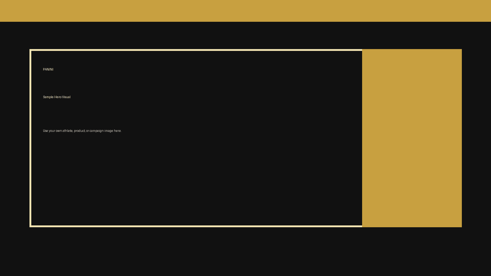
The hero stays full-bleed, while the copy column remains narrow and calm.
Visual thesis
Slide DNA, not UI chrome.
The deck is doing three jobs well: it creates atmosphere, it keeps hierarchy blunt, and it leaves large visual planes intact. The web system should protect those three behaviors first.
01
Black does the heavy lifting
The deck reads as near-black paper with subtle grain, not as a bright sports microsite. Gold and red should only punctuate the composition.
02
Condensed type owns hierarchy
Big uppercase headlines create the Panini feel faster than gradients or ornaments. The page should lean on condensed display rhythm first.
03
Frames beat cards
Slides rely on rails, edge lines, and bold image windows. Preserve that editorial framing instead of defaulting to boxed SaaS components.
04
Imagery earns the page
A Panini surface needs one dominant image plane per section. Supporting text should be short and placed where the picture can still breathe.
Master slides
117
The deck is expansive and template-led, so the web system should feel modular without turning into component soup.
Presentation ratio
16:9
Wide compositions, long horizontal rules, and cinematic crops are doing more work than boxed cards or dashboard grids.
Embedded media assets
49
The brand is image-forward. Web layouts should reserve large planes for photography, mockups, and campaign art.
Support and detail
Presentation-led framing
Use framed image planes, offset rails, and one bold accent block instead of stacks of rounded cards.
Rule 01
Keep the poster energy
Every section gets one visual job. Hero, proof, detail, and CTA should each read at a glance instead of competing inside one dense screen.
Rule 02
Use gold as signal
Gold belongs on key lines, counts, buttons, and trims. When it becomes a full-surface background, the brand loses its premium contrast.
Rule 03
Translate, do not transpose
The PowerPoint masters define attitude, hierarchy, and spacing logic. Web navigation, forms, and interactions still need web-native affordances.
Rule 04
Build around reusable bands
Hero, split media, metric strip, narrative list, and final CTA are enough for the first system. Everything else should extend from those bands.
Final CTA
Build Panini pages as editorial bands, then map the same content to decks.
This preview is the baseline. The next pass should extract the hero, metric strip, split media band, and final CTA into reusable sections for partnership pages, approvals, and recap storytelling.
First implementation pass
Deck-faithful tone, web-native composition, and a lean reusable system instead of a copied PowerPoint demo file.